Posts

Image
Abstract illustration  I am not familiar with any of the artists on the list, however this adds spontaneity to this exercise. Picking blindly, I choose George Gershwin. I have chosen 'Summertime' from his compositions.  The track is just over 5 minutes long. Having never created an abstract piece, I intend to work quickly with the music and freely. The exercise asks for mixed media. In the first instance, for looseness I have chosen to work with chalks.  The title in itself conjures up images of Summer, however I didn't want to work with definite images so I closed my eyes and followed the task in hand, to create marks. My movement consisted of long strokes, curling in on themselves. The colours I used were blues, oranges, yellows and greens (Summer).  I opened my eyes to  see a very rough image. I especially like the top right hand corner of the image, where the blue envelopes the orange - A Summer sky. I looked at my long strokes and like the idea of ...
Image
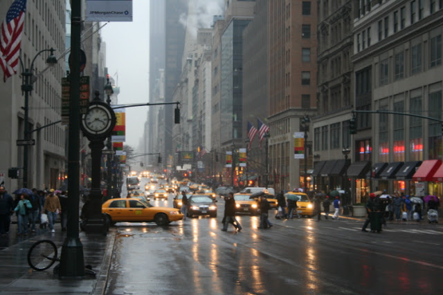
Image development... My chosen photograph to explore: 'A Rainy Day in New York' .  There is tremendous amount of movement in this snapshot and my colour print out of this photograph did not show this, the minute details were distorted so I have chosen to present this image in different ways electronically, the importance being that I can see, and you can see all of the detail in the one second of time captured in this photograph.  1. Time Running against the clock. The clock is my focus due to its immense size and stature. However the hot tones of the yellow taxi cabs demand visual focus and the head lights of cars burn through the grey haze of the city street.  2. America The flag draws my eye immediately,adding significance, a location without needing to be told. This important clue of location distracts me from the stature of the clock. Busy shoppers sheltered under umbrellas fill the street. A bicycle has fallen to the ground at the forefront, some...
Image
Reading an image... Look carefully at the image.   This is what I see in a 'pecking order' of visual importance.  A sleeping red, large dragon.  A green throne.  Gold coins, treasure.  Two child figures.  Armour - Swords, shields, daggers, axes, helmets.   A hot fire lantern.  Heat on the ceiling. A cold blue cave.  What the image is about. What is it saying?  Two children have entered a cave with a fire lantern. One child appears to be embracing the scene, one child appears nervous standing behind the other. Within the cave they have found a large sleeping, red dragon. The dragon is wrapped around a royal green throne. The throne is surrounded by treasure. It would appear the dragon is there to protect the throne, his tale rests upon it.  At the forefront of the scene is a pile of armour and weaponry.  Work out the narrative and identify the story.  Two children have gone out in pursu...
Image
Illustrating visual space... As asked, and working within a square format, I have printed images of a tree, a building (a church) and a child running. I piece the images together to create a scene:  In this image, the figure of the child is at the smallest I could print without losing the definition of the figure. The child is in the distance, running down a hill from the church towards the very largest of my tree prints. Working with a diagonal line in the distance gives the child a sense of speed.  This is actually my favourite as the diagonal line has been so effective in communicating the fun and speed of the child.  In this image, the tree and and church are horizontal and the child is in the forefront of the scene. The horizontal nature of this scene creates a sense of balance, a visually pleasing, and calm space. Adding the simple, curved angle line of the church path, draws the eye to the child, I;m pleased with how effective a simple line can be....
Image
ASSIGNMENT TWO:  'Point of sale'  After research, my ideas and observations,  here are my final images.  SUMMER: 12x12 inch. Watercolour on acrylic paper.  AUTUMN:    12x12 inch. Watercolour on acrylic paper.  Conclusion: This assignment was so interesting!  'Be bold and brilliant'.  'Bright and vibrant colours grab peoples attention'. Through my research, these words really stuck with me and I wanted to commit to them in my delivery.  I was especially influenced by Zazie Bulles during this exercise and was happy to use the 'splatter' technique so brilliantly used by this artist (previously experimented with in the 'exploring drawing and painting exercise).  'Quality' was the focus in the brief', I tried to make my displays look fresh, colourful  and exciting. I feel excited by them!   
Image
ASSIGNMENT TWO:  Ideas and observation... I started my search for inspiration with my mood boards:  SUMMER:  AUTUMN:  I found the orange and purple colour contrast most exciting in the Autumn selection. The purple inspired by Zazie Bulles :  On my travels I was drawn to the imagery used by 'Pret a Manger' that I collected. The fruit and vegetables are bright and vibrant highlighted more so with the simple white background. The dissected pieces are fun and cleverly matched together.  The text being made up of different fonts is a classy twist. I find this marketing idea quirky and exciting. I just love the larger than life broccoli with a make shift ladder propped up beside it. Could a giant vegetable highlight quality? I think it does in this image, big and succulent. The very best.  I also took a wonder and picked a home grown apple straight from the tree. It is a beautiful apple, so perfect with its leaves ...