Abstract illustration
I am not familiar with any of the artists on the list, however this adds spontaneity to this exercise. Picking blindly, I choose George Gershwin. I have chosen 'Summertime' from his compositions.
The track is just over 5 minutes long. Having never created an abstract piece, I intend to work quickly with the music and freely. The exercise asks for mixed media. In the first instance, for looseness I have chosen to work with chalks.
The title in itself conjures up images of Summer, however I didn't want to work with definite images so I closed my eyes and followed the task in hand, to create marks. My movement consisted of long strokes, curling in on themselves. The colours I used were blues, oranges, yellows and greens (Summer).
I opened my eyes to see a very rough image. I especially like the top right hand corner of the image, where the blue envelopes the orange - A Summer sky. I looked at my long strokes and like the idea of growth, the long green stems of a plant perhaps.
George Gershwin's 'Summertime' was written in 1934, a jazz inspired song written as a lullaby for Clara to sing to her child, for the opera 'Porgy and Bess'.
Now understanding the inspiration for the track and who it was intended for, a child I go again, Using the top right hand square of this image as my starting point.
This time, I want a bold and child like media. I listen to the track again, which gives me a further 5 minutes of opportunity. This time I cut bold colours of paper to the music. I include the swirls (original marks) of the blue sky, the yellow sun. A darker blue in the background, a hot day turning into a Summer's evening, a lullaby. Long green stems and this time I add purple for Lavender. I arrange them into a Summer scene.
Would this make a good CD cover?
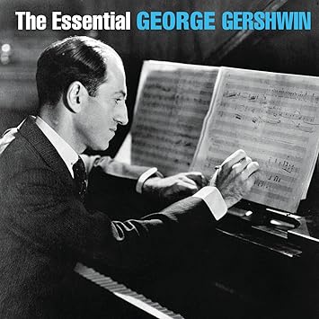
Here is an example of s George Gershwin's CD cover:

This is a traditional genre of music, the feel of it is reflected in the album cover above.
An abstract piece would certainly act in complete contrast to this. However with this original motivation for the composition in mind, my abstract illustration does add a young element to this song visually.
As much as I love the bold nature of this look. I decided to refine it a little to add a slightly more adult feel about it. This time using coloured pencils. I also changed the angle, with the lavender growing up from the bottom. I much prefer this illustration:
Reflection:
I have enjoyed the development process of this exercise. With time my initial sketch has become a more refined piece. Abstract art is far removed from my personal style of work, a style that I have been unfamiliar too. However, this exercise has given me the opportunity to be free and colourful, bold and adventurous.
I have been exploring the work of Wassily Kandinsky whilst working my way through this exercise. His bravery and boldness with colour is extraordinary. I visited the Tate Liverpool to take a closer look at his work and what I realised is that by editing my abstract piece, I actually took the energy out of it. The most energising part, was my initial, quite wild drawing. Seeing Kandinky's work close up highlighted this to me. Lesson learnt.
TATE LIVERPOOL:
Reference:
Album cover: The Essential Gerwin.
www.biography.com/people/george-gershwin-9309643win.
Visit to Tate Liverpool to explore the work of Wassily Kandinsky.
Album cover: The Essential Gerwin.
www.biography.com/people/george-gershwin-9309643win.
Visit to Tate Liverpool to explore the work of Wassily Kandinsky.


Comments
Post a Comment