Making a mock-up
My chosen book cover from my book shelves is The Resurrectionist by James Bradley.
"Leaving behind his father's tragic failures, Gabriel Swift arrives in London in 1826 to study with Edwin Poll, the anatomist. But he finds himself drawn to his master's nemesis, Lucan, the most powerful of the city's resurrectionist's and governor of its trade in stolen bodies.
Dismissed by Poll, Gabriel is pulled into the sinister and mysterious underworld of Georgian London - and must make a journey that will change his life forever"
This book is described as "A classically, claustrophobic Gothic thriller"
The front cover:
What I like about this cover:
- The silhouette of the black Ravens.
- The tone of the grey and blue.
- The red blood coming from the top of the image.
- The book title is printed in the same blood red.
The back cover:

What I like about this cover:
- The continuation of the blood red coming from the top of the page.
- The text is printed in the same red.
- Again, the continuation of the colour tones.
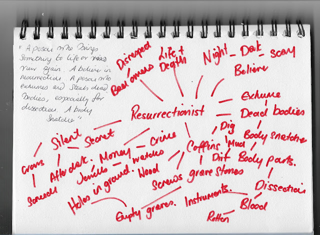
The dictionary definition of 'resurrectionist', this always helps with start from a basic understanding:
A person who brings something to life or view again.
A believer in resurrection. A person who exhumes and steals dead bodies, especially for dissection. A body snatcher.
I start by brainstorming 'resurrectionist' to help start my thought process.
Brainstorm:
MOOD BOARD:
This is a Gothic and sinister tale and these are the images that I was drawn too. I am curious of the superstition that surrounds the Raven.
"In Greek mythology, Raven's are associated with Apollo, the god of prophecy. They are said to be a symbol of bad luck, and were the god's messengers in the mortal world. According to the mythological narration, Apollo sent a white Raven, or crow in some versions to spy on his lover, Coronis"
I also wanted to take a look at other books by James Bradley. These are five book covers that I selected. Naively, I thought perhaps there would be similarities in style, however as I have found out, they are all different: Different stories, different ideas behind the illustration.
Ok, so now I want to have a play around with arrangements, mindful of the elements that I like in the book cover as it stands. The Ravens and the red blood.
I measured the size of the book, it is 12.5cm x 19.5cm. I scale my thumbnails to a size that is in proportion the size I will be working too.
Thumbnails:
As the Raven is key to my idea, I do some quick sketches of the birds lining the roofs of my street. As the screech of the Raven is so distinctive, I particularly like the position of the calling Raven.
My thumbnails also saw the introduction of a pocket watch. I like this symbol of time that has stopped. Whilst the body is snatched, within the pockets of the deceased, there are jewels to be found.
Sketches of a pocket watch:
Rough:
I measure the book exactly and divided my page up with the correct dimensions. I draw a line drawing of where my bird, pocket watch and text boxes will appear.
In this mock-up, the pocket watch is tied around the Ravens neck, however in reality I would like the watch hung from the birds beak.
As this is a chilling and grisly tale, I would like the cover to appear blood soaked to give the impression that the Raven has picked the pocket of the freshly deceased body.
Colour Visual:
My hand drawn book cover.
A red, blood soaked cover. A Raven rising from the blood and a stolen gold pocket watch.
A combination of watercolour, ink and poster paints.

Final mock up:
I used the editing package Picassa to add the text onto my cover.
I wanted to keep the text as it was on the original cover, the wording remains the same. To write this in by hand felt a little too amateur.
I tried to choose fonts, most similar to that used on the original book cover, a combination of 'Gabriola' and Arabic 'Typsetting'.
Reflection:
Drawing the book cover by hand naturally has its limitations, to edit any part of this would mean to start the process again. Looking at the cover over a few days, I can see that it is not entirely obvious that the Raven is rising from the blood soaked cover. I would amend this element if I was to do this over again.
As mentioned previously, it is at this point that I appreciate how creating this mock-up digitally would open up far more opportunities in terms of editing my design, I do hope to progress onto working digitally in the not too distant future. However for now, creating this design by hand, has made me far more considerate with the step by step design and thought processes, knowing that is is not so easily corrected if I make an error.
As for the placement of the Raven and the stolen pocket watch, I am happy with this design. My execution could do with being more professional, I can see. However, ever eager to learn I am aware that every mistake I make, is a lesson learnt.


Comments
Post a Comment