Museum posters
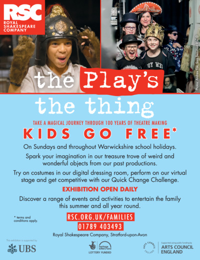
For this exercise I am using the permanent exhibition 'The Play's the Thing'. An exhibition situated in the Royal Shakespeare Theatre, exploring all of the elements it takes to bring Shakespeare to the stage.
I start by taking some time in the exhibit, photographing the pieces and grouping them into the age groups.
Child (5-9)
My focus here were the playful elements of theatre - swords and shields, musical instruments and props. Always a big hit with small children and wooden swords to play fight.
My focus here were the playful elements of theatre - swords and shields, musical instruments and props. Always a big hit with small children and wooden swords to play fight.
Teenager (13-16)
My focus here were the more grizzly elements of theatre. The human skull, famously used in Hamlet. An axe for executions, and a portrait of a troubled Lady Macbeth, haunted by murder. The darker elements that would capture the imagination.

General adult audience
Always an attraction is the expanse of costumes within a stage show, the colours of the costume and the skill and workmanship of creating them. An oil portrait of William Shakespeare himself and an original first folio of this works. The historic and important elements.

Examples of museum posters...
The are bold and brilliant and vary such a lot in design. The child like hand drawn dinosaur on the far right is the perfect fit and although child like in design, perfectly effective. Likewise the big black X on the far left against the yellow background is so striking and bold. The light bulb with the moths flying around the light against a nigh time blue is beautiful. There is clearly no set way, they are all different and all very striking.
The current 'The Play's the Thing Poster'...


Brainstorm:
In my preferred way, I separated the words of the name again and doodled as I went. What came from this a great deal came from the word 'Play's' however when interpreting the word 'Thing', only a select few words came to me and they are: First Folio (the book of Shakespeare's work), Shakespeare (the man himself), and writing (the thousands of words he wrote). Despite this being a limited offering, this felt brilliant to me. I'd hit upon what makes this exhibit 'the thing'!
So from here you will see that one of my doodles is a pile of sheets of paper, hand written scripts. Roughly drawn is one of the prop swords pierced into the top. I scribbled the thought of using the scripts in all 3 age groups; however I would change the prop above the sheets according to my audience range, selected from my catalogues above. This way, the symbol of the first folio, Shakespeare and written words, remains in all three designs. I selected three props from my doodles.
Thumbnails:
Here I worked with a number of ideas, all centred around the pile of scripts. Alongside each thumbnail, I wrote what emotion and thought that prop or idea says to me.
For child (5-9) I have selected a sword. Protector of words, War. Battle. Tragedy. Hero.
For teenager (13-16) I have chosen the axe. Violence. Bloodshed. Grizzly endings. For general adult I have selected the first folio book. Years of words.
I then looked again at the positioning of these ideas. I love the drawing looking like a doodle, I like the hand drawn affect. I like the black and white scribbled lines. The book could look more interesting if it was shown at a different angle with the pages appearing a little looser, like they have just been read and turned. Should I add the bulb above the book? The axe could appear embedded a little further into the paper, should I add blood or too grizzly?
Pencil sketches:
I used a centre line to help with position, ensuring enough room at the top and the bottom of the page for text. I observed the props for detail.
Final designs:
Here I used writing ink and continued with my scribbled hand drawn look idea.
Child:
Reflection:
This exercise has taught me yet again how interesting I find the brainstorm at the very beginning, it is here where I find my initial idea,I find playing with the words fascinating. In this case whilst doodling around the words. I am really happy with how this exercise progressed, mainly because it grew organically and it was an experiment to use one running theme throughout all three designs, an experiment that I feel worked well for me. Oddly, in I looked at many coloured poster designs at the beginning of this process, yet find the black and white of these images also striking. If I was to continue to play with these designs, I think I would shrink my designs down in size, really small....Perhaps this would be more visually appealing, I stark white page with a tiny hand drawn design in the middle?
Here I used writing ink and continued with my scribbled hand drawn look idea.
Child:
Teenager:
Adult:
Final Client Visuals:
I added two similar but different fonts here to show where the clients text would be added. The top font is AR Blanca and the museum name is AR Berkley. I selected these two fonts because they are classic and in tune with the theme of the handwritten style I have chosen to go for.
Child (5-9) My chosen piece...
Teenager (13-16)
General adult audience:
This exercise has taught me yet again how interesting I find the brainstorm at the very beginning, it is here where I find my initial idea,I find playing with the words fascinating. In this case whilst doodling around the words. I am really happy with how this exercise progressed, mainly because it grew organically and it was an experiment to use one running theme throughout all three designs, an experiment that I feel worked well for me. Oddly, in I looked at many coloured poster designs at the beginning of this process, yet find the black and white of these images also striking. If I was to continue to play with these designs, I think I would shrink my designs down in size, really small....Perhaps this would be more visually appealing, I stark white page with a tiny hand drawn design in the middle?


Comments
Post a Comment