Assignment four:
Magazine Illustration
Magazine Illustration
For this assignment I have chosen to work with the word 'lost'.
Brainstorm:
What came of my brainstorm was the emotional aspect of 'lost', feeling lost. 'Escape', 'lost at sea', 'boat', 'storm' 'ocean', 'vast', 'space'. These are the words I am going to carry forward into my work.
Mood board:
Research and inspiration:
I particularly like this piece of work by artist Judith Brandon entitled 'Cleveland Scene'. There is separation between the ocean and the sky yet the same tones of blue remain throughout the painting. The marks in the sky depict fireworks. The movement in the waves is visible. I like the style of the painting, informal, playful and different.
I also looked at exampled of magazine illustrations for research into what works. They are dramatic enough to reach you, yet uncomplicated/ colourful and dynamic. All are digitally produced.
This is my favourite piece that I sourced by Daniel Mitchell Illustration. So obvious in its meaning. So original and clever. I like the block yellow colour of the background, it captures your attention first of all. The magician's rabbit being pulled out of an open brain - trickery. This illustration is uncomplicated and obvious in its meaning. Simple lines. Accurate drawings.
This illustration by Andrea Cobb is pretty and delicate in style. Patterns and marks fill the background. Varying tones throughout. The centre piece depicting a female with an umbrella, perfectly fitting the title of the magazine article, again, obvious.
Here I let my thoughts wonder, and played with lines colours and marks.
In the previous exercise 'Menu card' working with the sea as inspiration was a joy, so I look forward to producing an illustration using this as inspiration. The style I used for that exercise also came naturally, the black thin lines against a white background.

Thumbnails:
Here I explored where to position my boat. I also looked at the movement of the water. Should my boat be raised? I also played with the idea of the boat positioned inside a timer, "lost and running out of time". I want the water to appear vast. I want my illustration to show vastness, lost in the middle of nowhere. I want this feeling to bring calm thought, a sense of wellbeing rather than panic. A break away, lost in thought rather than fear and worry.
With these two, I added tools to navigate through the feeling of being "lost" I added oars and a compass.
With my theme in mind, I started to look for a boat that I could work with. I photographed these wooden rowing boats locally.
Still life drawing:
Using a pencil and fine liner, I sketched the rowing boat as accurately as I could. I used a centre line to try and keep all elements of the boat to scale.
Using a pencil and fine liner, I sketched the rowing boat as accurately as I could. I used a centre line to try and keep all elements of the boat to scale.
Tonal version:
I sketched the boat and this time using pencils of varying hardness to add the tone. I also used a charcoal pencil. As the boat is so pale in colour, I added charcoal to the water. Now even though this became a little heavy and difficult to manage, I like the way the darkness of the water makes the boat pop out. I also changed the angle of the boat as I picture the boat at sea and this is the angle I have in mind.
Narrative:
As I was sketching ideas for this illustration, I took a close look at the words I had been noting as I drew...
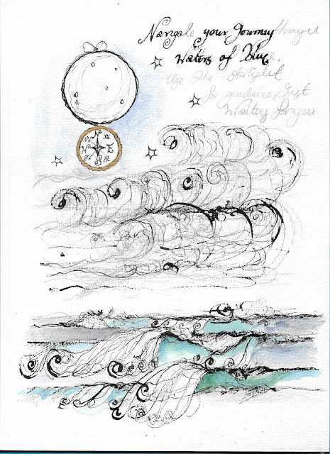
"Navigate your journey through waters of blue, into starlight and wonder just waiting for you..."
"Sometimes I feel a little lost at sea, yet it's quiet here, just the water and me..."
I also played with marks and colour here. I looked at the movement of the sea. Here I also looked at the idea of a compass hanging from the moon. Feeling lost emotionally is usually and hopefully only temporary and I want my illustration to show a way of navigating oneself out of it.
I also looked at exaggerating and distorting the water. I love the marks made here, there is a sense of beauty in them. I like this quote from 'The History of Illustration' by Derek Brazell and Jo Davies "I like to break boredom - to find a little place where the boredom stops where you can insert ideas into".

With watercolour, I also looked at tones of blue and green for the water.
Even though I was doodling here, I also added oars to this boat. Again, even though lost at the moment, they are another tool to navigate through.

As I was sketching ideas for this illustration, I took a close look at the words I had been noting as I drew...
"Navigate your journey through waters of blue, into starlight and wonder just waiting for you..."
"Sometimes I feel a little lost at sea, yet it's quiet here, just the water and me..."
I also played with marks and colour here. I looked at the movement of the sea. Here I also looked at the idea of a compass hanging from the moon. Feeling lost emotionally is usually and hopefully only temporary and I want my illustration to show a way of navigating oneself out of it.
I also looked at exaggerating and distorting the water. I love the marks made here, there is a sense of beauty in them. I like this quote from 'The History of Illustration' by Derek Brazell and Jo Davies "I like to break boredom - to find a little place where the boredom stops where you can insert ideas into".

With watercolour, I also looked at tones of blue and green for the water.
Even though I was doodling here, I also added oars to this boat. Again, even though lost at the moment, they are another tool to navigate through.

Line visual:
I looked through my ideas above and sketched how i would like my final illustration to look on the page. Now as this illustration is based on my still life drawing, I need to keep the perspective of the boat the same. The way I pictured the boat is from above so my drawing will be based on the view of looking down. I added the moon and the compass. Also taking inspiration from Judith Brandon's painting, I would like to add the sea and sky line.
Written on the compass you will see the words "Lost" and "Found".
Final Illustration:
Taking inspiration from the examples of magazine illustrations I selected in my mood board, I tried to adopt the same simplicity and boldness of colour. I tried not to over compliment. I used mixed media, watercolour, acrylic and a black fine liner and a little ink. I added some of the words to add narrative to the piece. I pulled together the elements and ideas I have pieced together through this assignment. Fearing that the words 'Lost' and 'Found' would be too small to be legible on the compass, I used letters instead.
1. On reflection here, I feel like the font (AR Berkely) I added here is too bold for the piece and takes up too many lines.
2. Here the delicate font (AR Decode) in italic matches my piece well. The smaller font works using only one line. I am much happier with the presentation of this. I feel is depicts peace and tranquility. A moment of pause. I also boosted the colour of the image to add more clarity.
Reflection:
I am inspired by the examples of magazine illustrations that I studied. It struck me how obvious they are as pieces, yet how detailed the design process must have been to reach that point.
This was an interesting exercise and I am very happy with the ideas that developed along the way. I am a big fan of words and often note short poems down as I work so it was really good to pick them off the page and use them in this piece.
As I wanted to try and keep my piece as uncomplicated as possible, I did miss including the beautiful marks that I explored earlier on in this exercise, however, now I know they are there, I can always use them again in the future.
As with all of my work so far, it does lack that element of finish which I'm still unsure of how to achieve. However as an idea, this one is strong and I'm happy it tells a story.
I have been reading the 'History of Illustration' throughout this assignment, which has been a handy tool when studying different styles of drawing and technique. "Everything has to be correct, I'm very conscious of that, but that does not stop me drawing with my imagination"... These words spoken by Victor Ambrus have stayed with me...
Amendment: After receiving feedback from my tutor, I placed my drawing at the top of an A4 sheet to visualise how it would look at the top of an article. I also added a title beneath the piece to visualise the of an article.
Reference:
'The History of Illustration' by Derek Brazell & Jo Davies.
'The History of Illustration' by Derek Brazell & Jo Davies.
Daniel Mitchell Illustration.
Andrea Cobb Illustration.
ammomagazine.co.uk


Comments
Post a Comment